
Boston College Primary Brand Colors
The official Boston College colors are maroon and gold.
In addition, black and warm grey are also used as part of the main color palette. Generally, black, gold, and maroon can be used in all areas of a publication. Use warm grey as a complementary color to the maroon and gold. Tints of the gold, grey, and black are also acceptable. The maroon is always used at 100 percent and should never be used as a tint.
Metallic gold should be used when possible in offset printing. If cost prohibits this, follow the CMYK (cyan-magenta-yellow-black) process-color equivalents noted on the swatches below to ensure accurate color matching. Please note that the metallic gold and PMS 202 print best on coated stock. If uncoated stock is chosen, pay special attention to large areas of color since they often appear uneven. (The colors shown are approximations of actual ink colors. How they display on your monitor may differ dramatically from the actual printed colors.)
For colors to be used on websites or in digital communications, refer to our web color guide.
Main Brand Colors
Maroon
PMS 202
CMYK: 0-100-61-43
Gold
PMS 874 (Metallic)
CMYK: 0-20-50-30
Warm Gray
PMS Warm Gray 11
CMYK: 0-17-34-62
Secondary Color Palettes
In addition to the primary colors listed above, secondary color palettes have been developed to further enhance publications while maintaining the visual brand of BC. Two palettes of colors were inspired by indoor and outdoor campus scenes: vibrant, rich jewel tones and subtle neutrals. These colors were specifically adapted to complement the main brand colors of maroon, gold, and warm gray.
The main brand colors should always be more prominent in publications, with colors from the secondary palettes judiciously used as accents depending on the tone of the printed piece. These should be mixed from the four process colors; the CMYK formulas are listed.
Jewel Tones

Dark Maroon
CMYK: 22-89-67-63

Dark Blue
CMYK: 80-25-0-75

Burnt Orange
CMYK: 0-60-90-25

Dark Slate Blue
CMYK: 50-10-10-50

Yellow Gold
CMYK: 0-30-100-10

Dark Green
CMYK: 40-20-60-50

Red
CMYK: 0-100-100-20

Leaf Green
CMYK: 20-0-60-45
Neutral Tones

Medium Cool Gray
CMYK: 54-45-43-10

Light Gray Green
CMYK: 31-17-25-0

Medium Turquoise
CMYK: 60-20-35-5

Medium Slate Blue
CMYK: 50-25-30-10

Sage Green
CMYK: 45-31-42-2

Light Sage Green
CMYK: 17-13-31-0

Light Mint Green
CMYK: 25-10-38-0

Light Warm Gray
CMYK: 25-22-32-7
Scenes captured in campus photography were the primary inspiration for choosing colors for the secondary palettes. Deep golds, blues, reds, and ochres can be observed in the vivid images of stained glass and landscape, as well as inside buildings and classrooms. Both subtle warm and cool neutrals can also be seen in different aspects of the same scenery.
Inspiration for Secondary Color Palettes
-
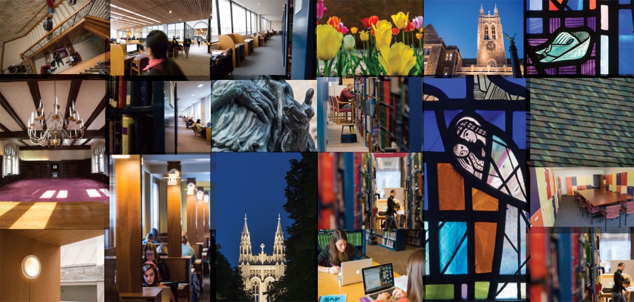
Rich jewel tones
-
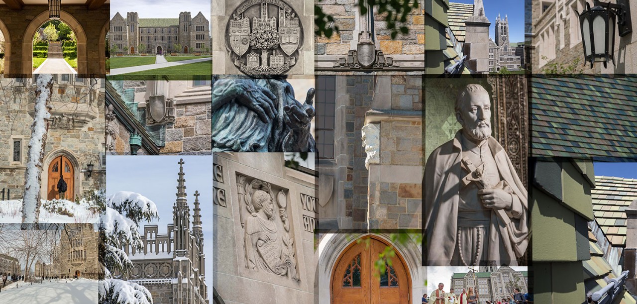
Neutral tones